
Best Practices for Building a Color System in Figma
How to build an effective and scientific color system in Figma?
After Figma’s variables feature was released, I decided to rebuild the color system for Bodcasts using variables. Through research and testing, I ultimately developed an effective and scientific color system. I’ve used this workflow in subsequent projects, and it not only helps me quickly build a color system but also ensures consistency. This article will share some best practices I’ve learned while building this color system, hoping to provide you with some inspiration.
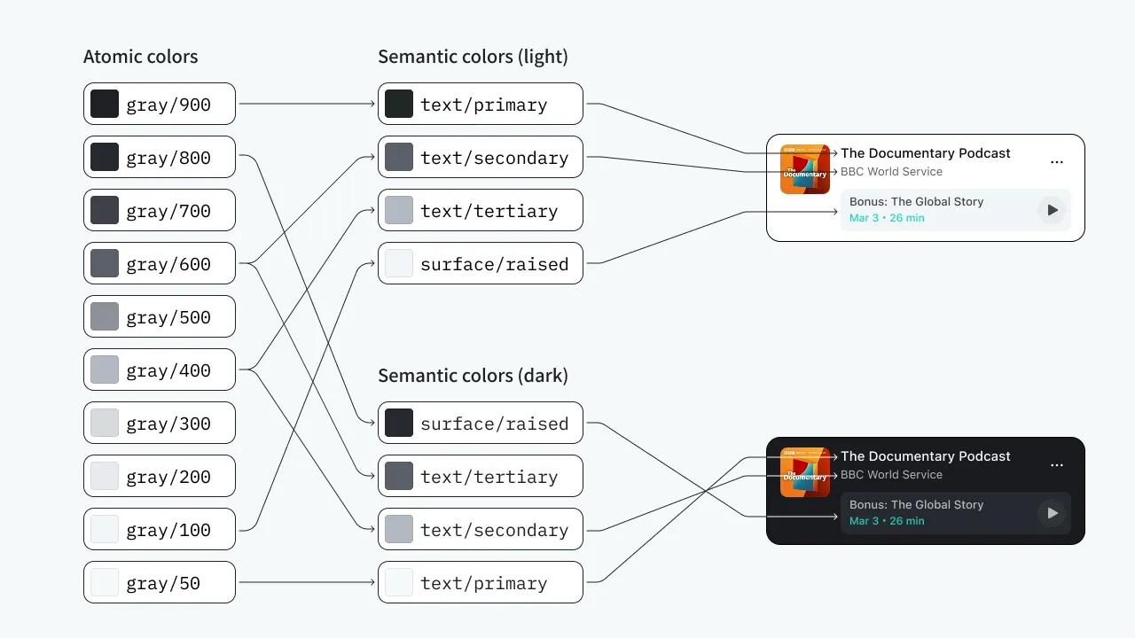
I adopted a common approach to building color systems: first define an atomic color palette, then create a semantic color system based on it, and define multiple themes (commonly light and dark) at the semantic color level. When designing, I use semantic colors directly. For color space, I chose Oklch because it’s mature, has many related tools, and can be used directly in CSS, with support across major browsers.
Next, I’ll demonstrate how I built this color system.
Creating the Atomic Color Palette
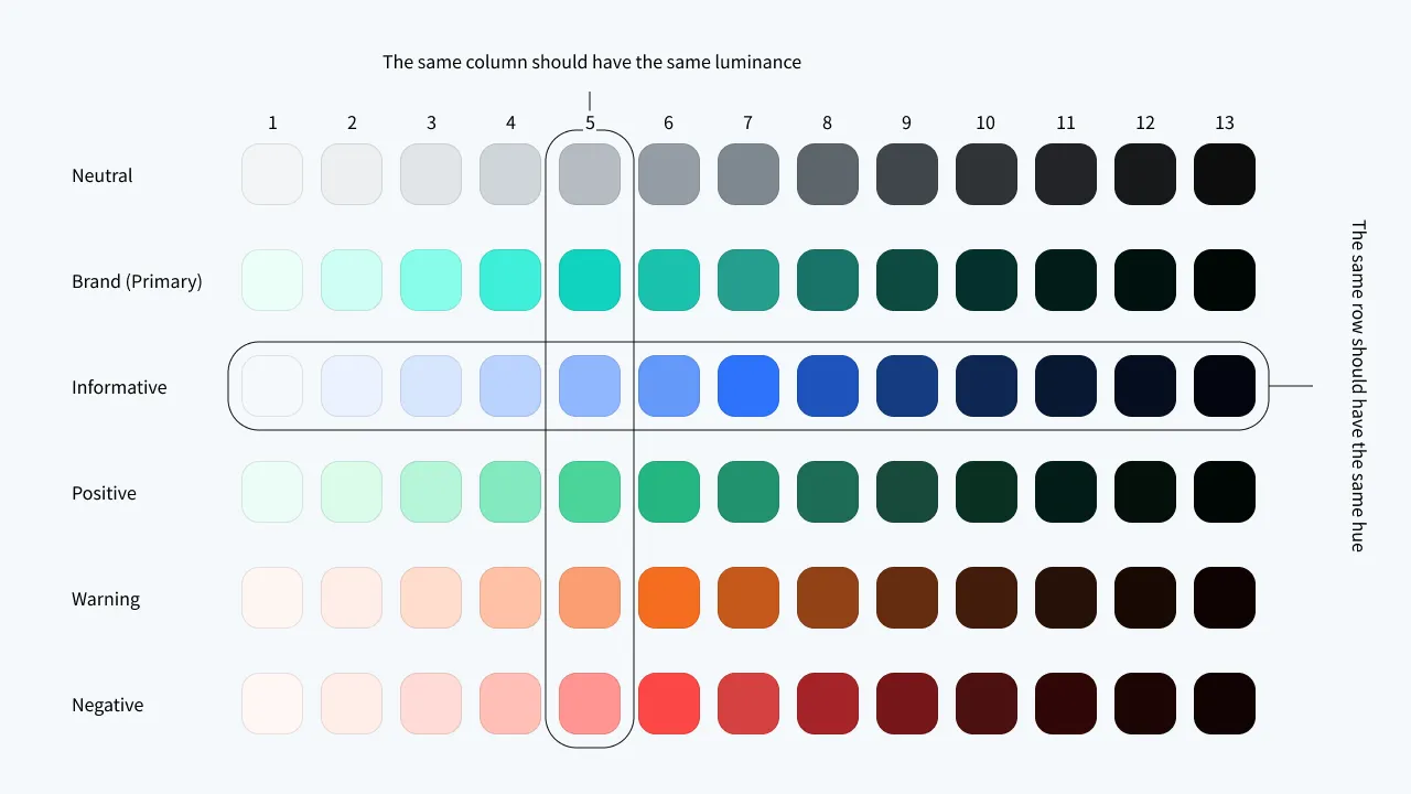
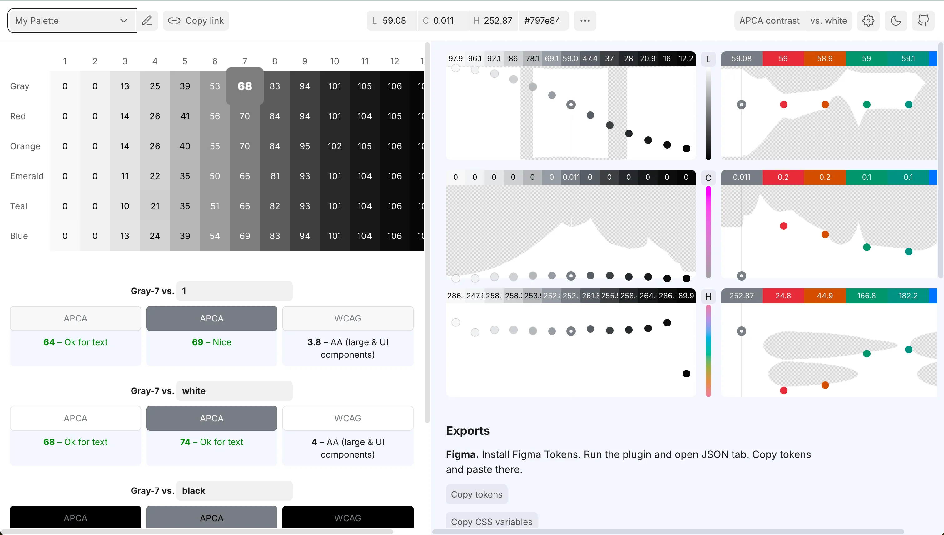
First, we need to create an atomic color palette. An atomic color palette typically includes neutral colors, primary colors (brand colors), and four accent colors representing information, positive, warning, and negative states. Each color family should include multiple brightness levels for different use cases. The most common approach is to organize them into 10 levels numbered 50, 100, 200…900. In this project, I use 13 levels to ensure adequate coverage.
Each column in the atomic color palette should have similar perceived lightness to ensure they have similar contrast ratios and consistent user perception. For example, if we choose the 6th level as background colors for different buttons (primary button, danger button, etc.), the contrast between text and background on each button type will be similar, providing a unified perception for users without situations where text is clear on one button but not on another.
Using huetone to Create the Atomic Color Palette
We can use https://huetone.ardov.me to create the atomic color palette. It uses the Oklch color space and helps us quickly create a color palette. Huetone includes many built-in atomic color palettes that we can directly modify.
After creating your own palette, select any color, modify the hue (H) at the top to your desired value, then click the more (three dots) button and select “Apply current hue to row” to batch modify all colors in that row to the same hue.
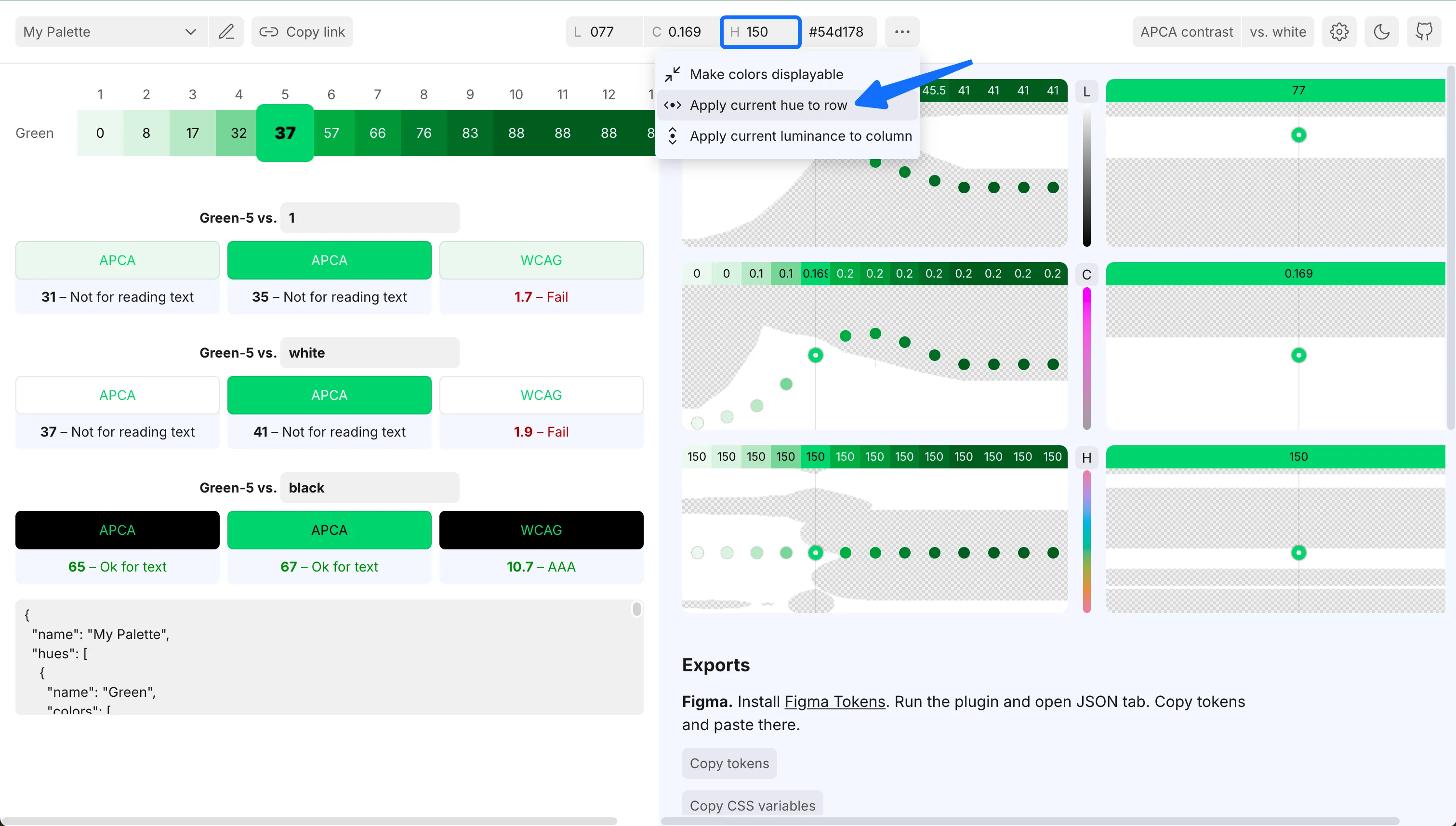
Next, we batch adjust chroma and luminance on the right side. First adjust chroma, keeping it close to the white area boundary with a shape that’s high in the middle and low on both sides. Then adjust luminance, with a curve similar to an inverted easeInOutQuad - gentle changes on both ends and steep changes in the middle. This is because colors on the sides are typically used for backgrounds or text and don’t need to be as saturated, while colors in the middle are usually used for accent colors and need to be more saturated.
Using the same method, we create the other colors. We can select each adjusted green color, then click “Apply current luminance to column” in the top dropdown menu to apply its luminance to the entire column, then adjust the new color’s chroma. You can also make real-time adjustments based on the contrast ratios displayed below.
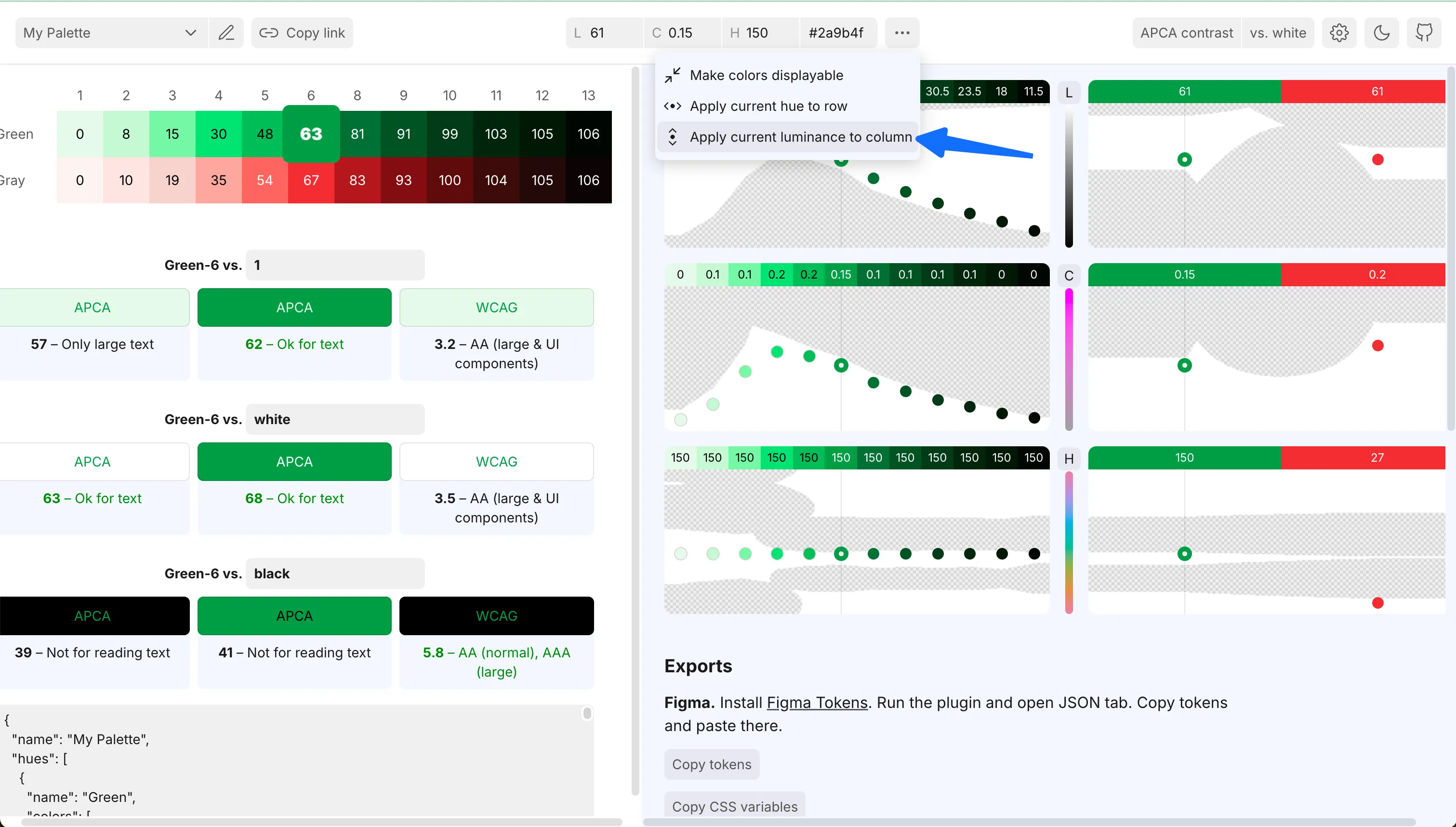
While adjusting colors, you can press B anytime to view all colors with chroma set to 0, making it easier to compare perceived lightness.
Importing to Figma
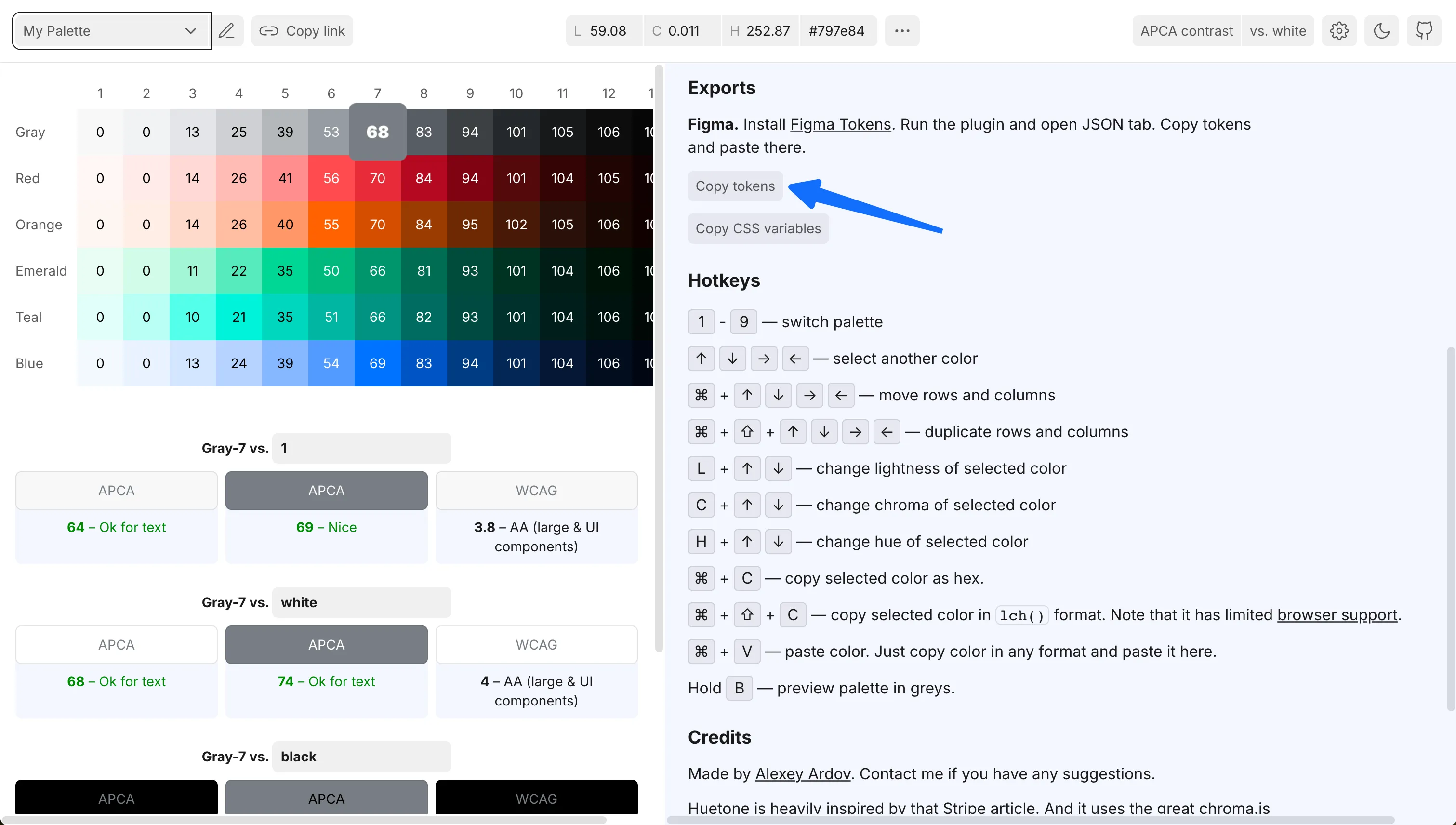
Once we’ve adjusted all colors, we can click the “Copy tokens” button under Exports on the right side to copy the adjusted palette data to the clipboard.
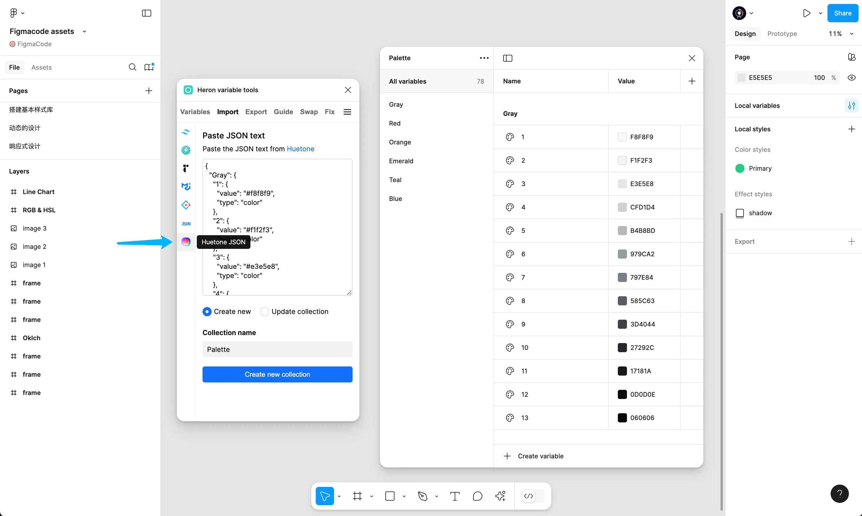
Back in Figma, we use the Import function of the Heron variable tools plugin to import the copied JSON data as variables.

Heron Variable Tools
Extremely powerful variable tool in Figma
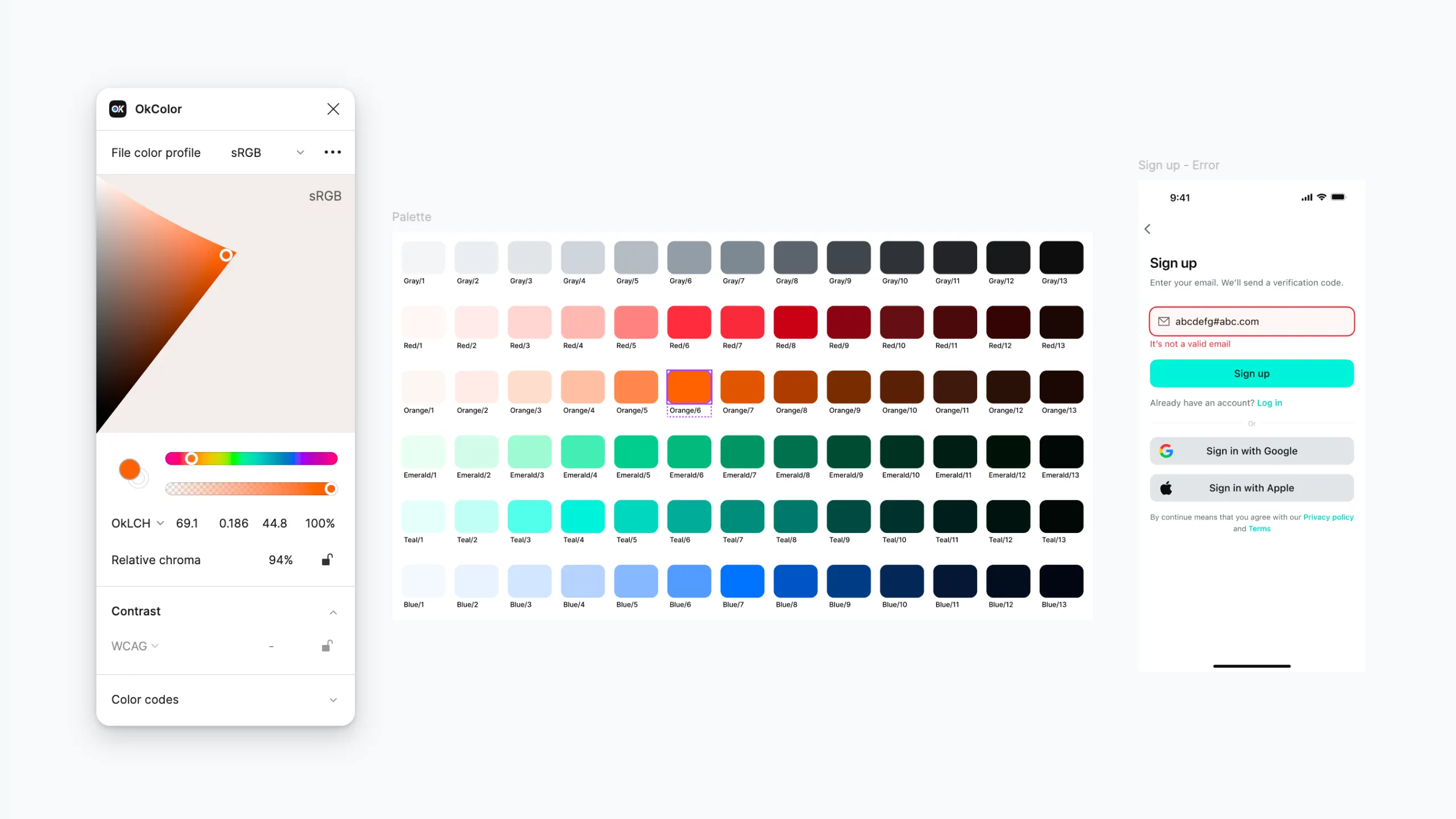
After importing to Figma, we can use the OKColor plugin to fine-tune colors on typical interfaces until their performance reaches our satisfaction, then update them in the variable table.
OKColor
Oklch color picker plugin for Figma
Creating Semantic Colors
Next, we’ll create semantic colors based on the atomic color palette - these are the colors we’ll ultimately use in our designs. A semantic color may consist of the following parts:
- Category: such as background, border, text, icon, etc.
- Role: such as brand (primary), positive, negative, information, etc.
- Hierarchy: indicating color strength, such as Primary, Secondary, Strong, Weak, etc.
- State: such as Press, Hover, etc.
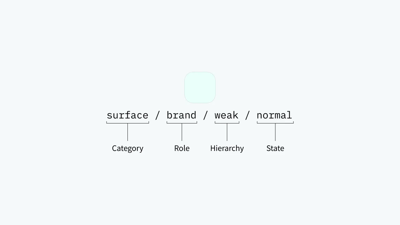
Of course, this is just one approach to semantic color naming - we don’t need to follow it completely. For example, in actual use, we might omit some parts, so the above color might be called surface/brand.
Accent Colors
Accent colors are those that prominently display important elements in the interface to attract user attention, such as primary colors (brand colors) and colors representing information, positive, warning, and negative states.
Accent colors play multiple roles in design - they can serve as background colors, text colors, and border colors. If we don’t want to make it too complex, we can unify them as one color to avoid having too many colors in the palette that make selection difficult.
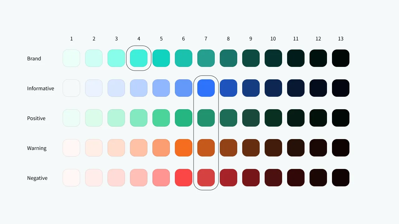
Accent colors typically use high chroma colors (highly saturated, vivid colors), but we must also consider contrast. From the figure below, we can see that the primary color has the highest chroma in the 4th position, blue has the highest in the 7th position, and the other three colors have the highest in the 6th position. However, the 6th column has too low contrast with white, so considering everything, we select the 7th column as accent colors. The primary color is special - the 7th position is too dull, so we still select the 4th position.
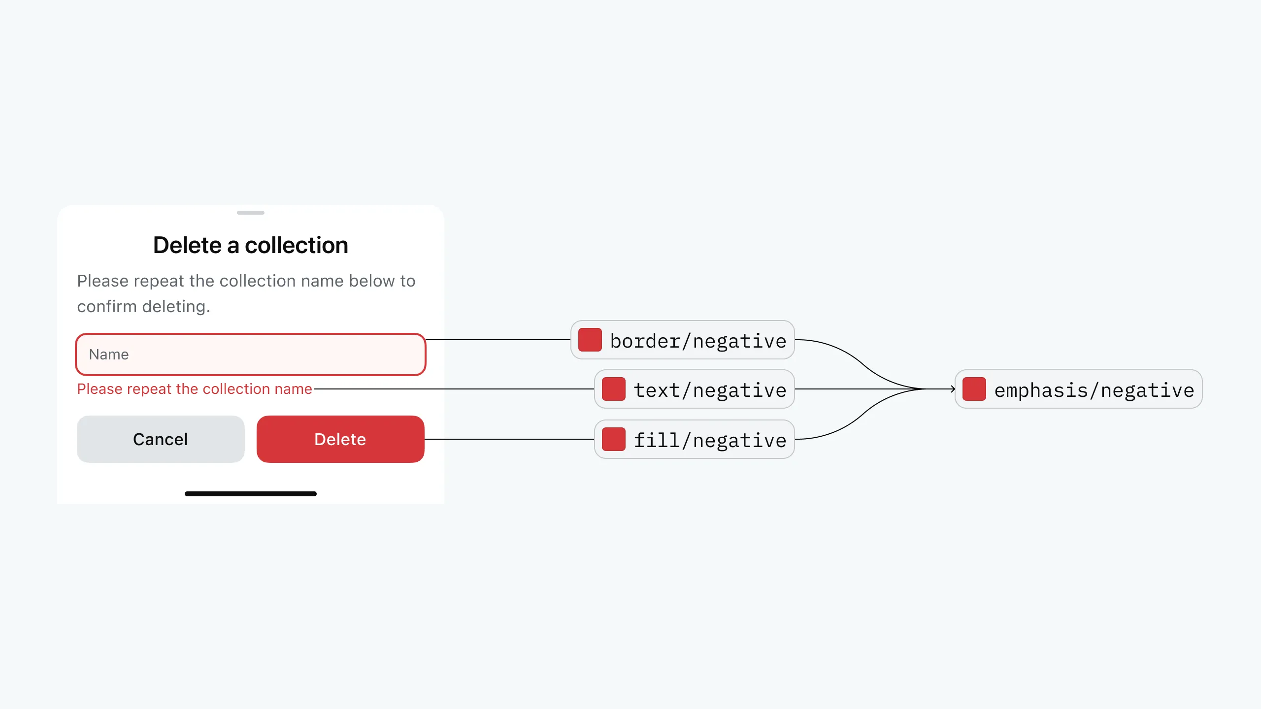
Colors on Accent Colors
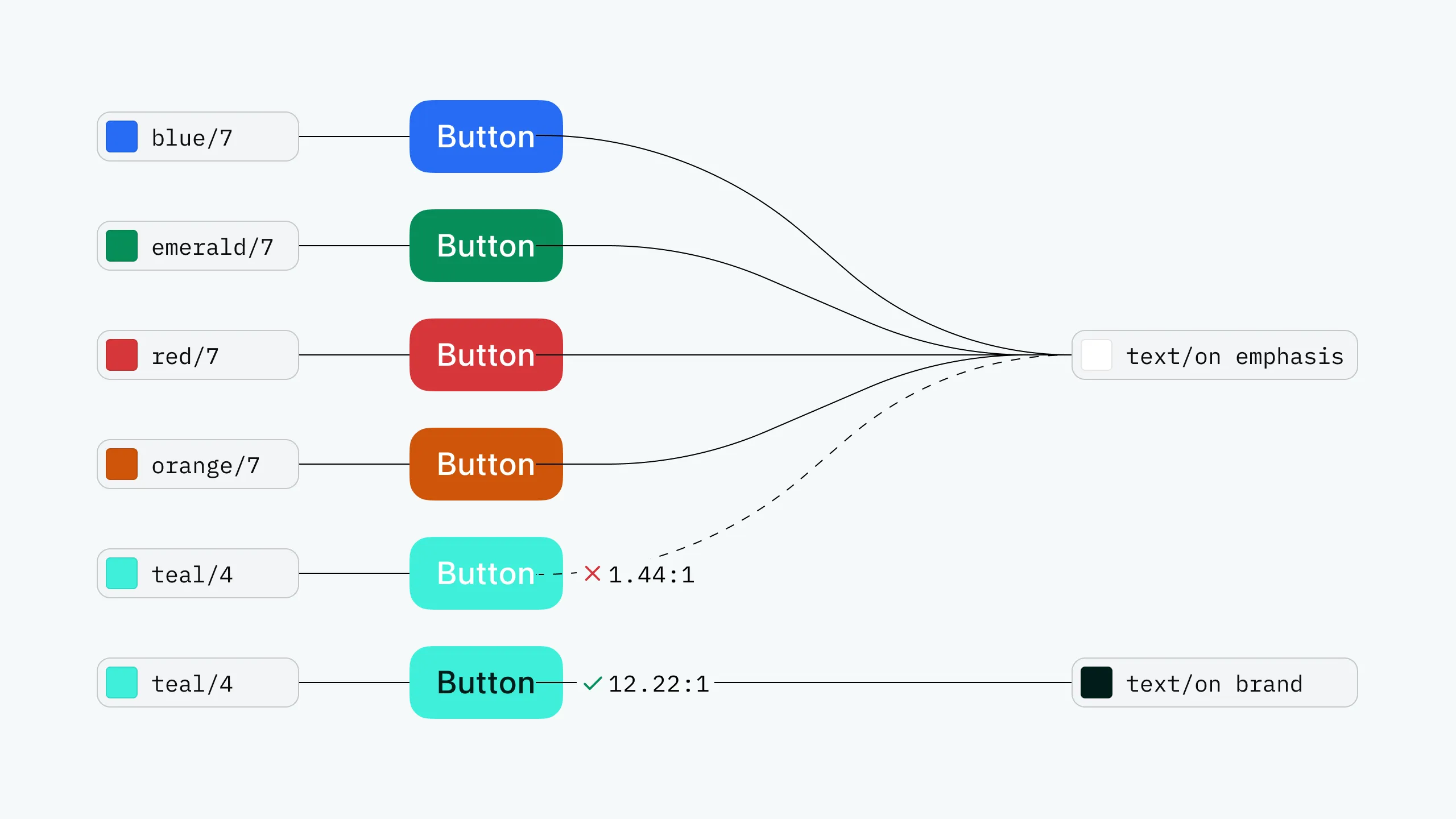
Colors used on accent colors can be named with on ***. For example, text color on buttons can be named text/on emphasis, which remains the same white in both light and dark modes. For the primary color, since we selected teal/4 with a lightness of 88, white text on it would be hard to see. So we create a new variable called text/on brand specifically for use on the primary color.
Primary Color Issues
While we solved the problem of unclear text on primary color backgrounds, we haven’t solved the issue of it being unclear as text or border color. To fix this, we create another variable brand-2 using lower lightness, and rename the previous primary color to brand-1. As shown below, using one primary color on the left makes the “Resend” text hard to see; using the darker brand-2 (lower lightness) for text and border colors on the right makes the text clear.
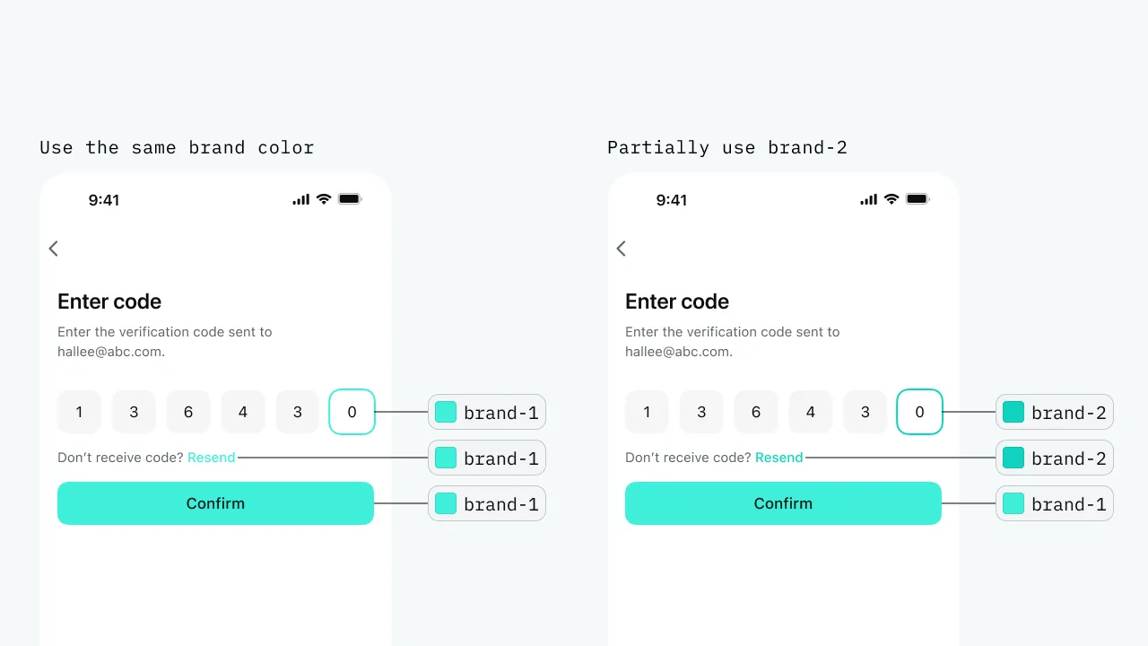
In other scenarios requiring primary colors, we can choose brand-1 or brand-2 as needed.
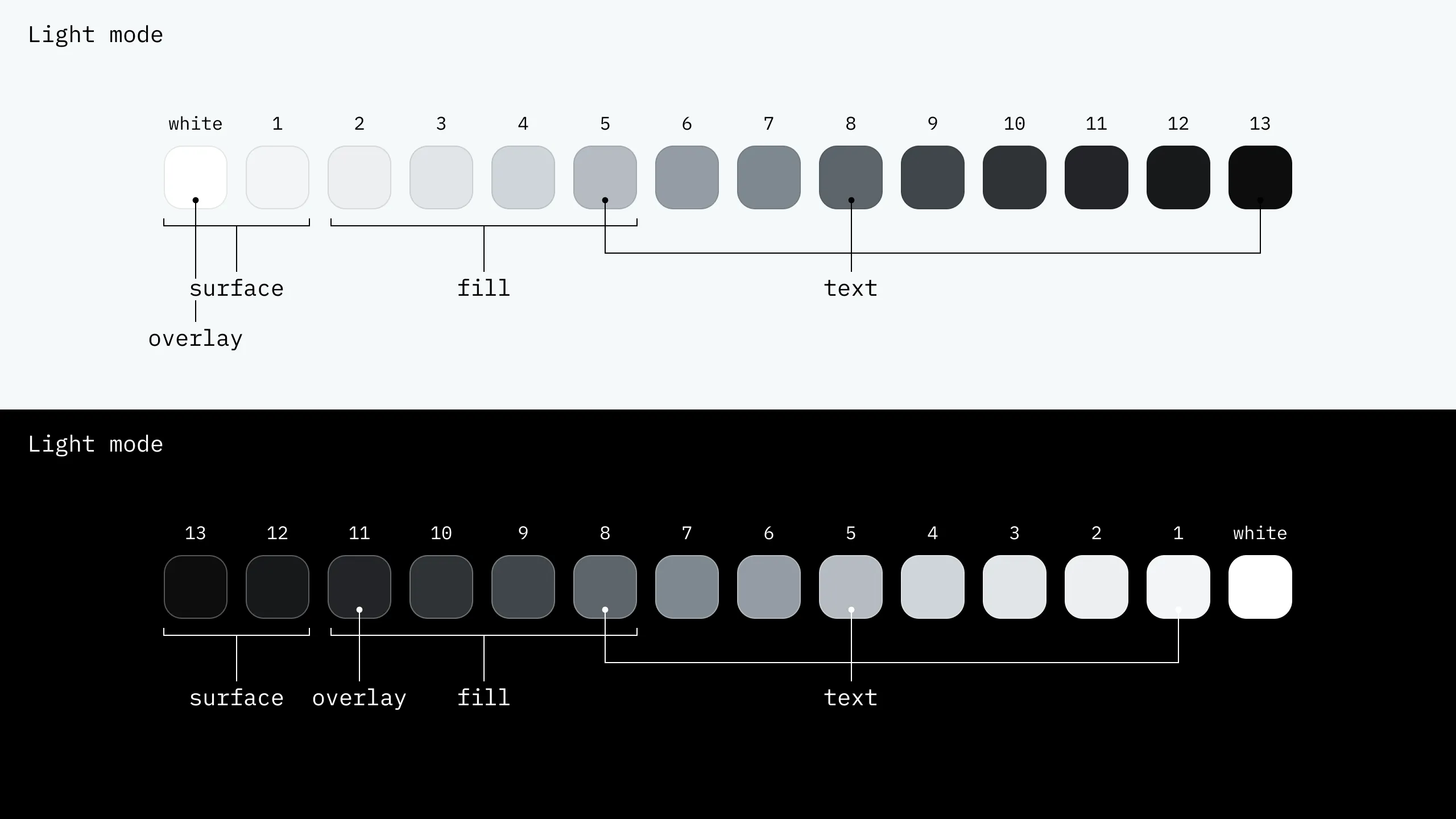
Neutral Colors
Neutral colors are typically used as background or text colors. In this project, background colors are divided into surface and fill categories. Surface colors are used for large area backgrounds like overall interface backgrounds and card backgrounds; fill colors are used for smaller elements like buttons and switches. Surface and fill don’t overlap because fill might appear on top of surface, and overlap could cause elements to be buried.
Variable Settings
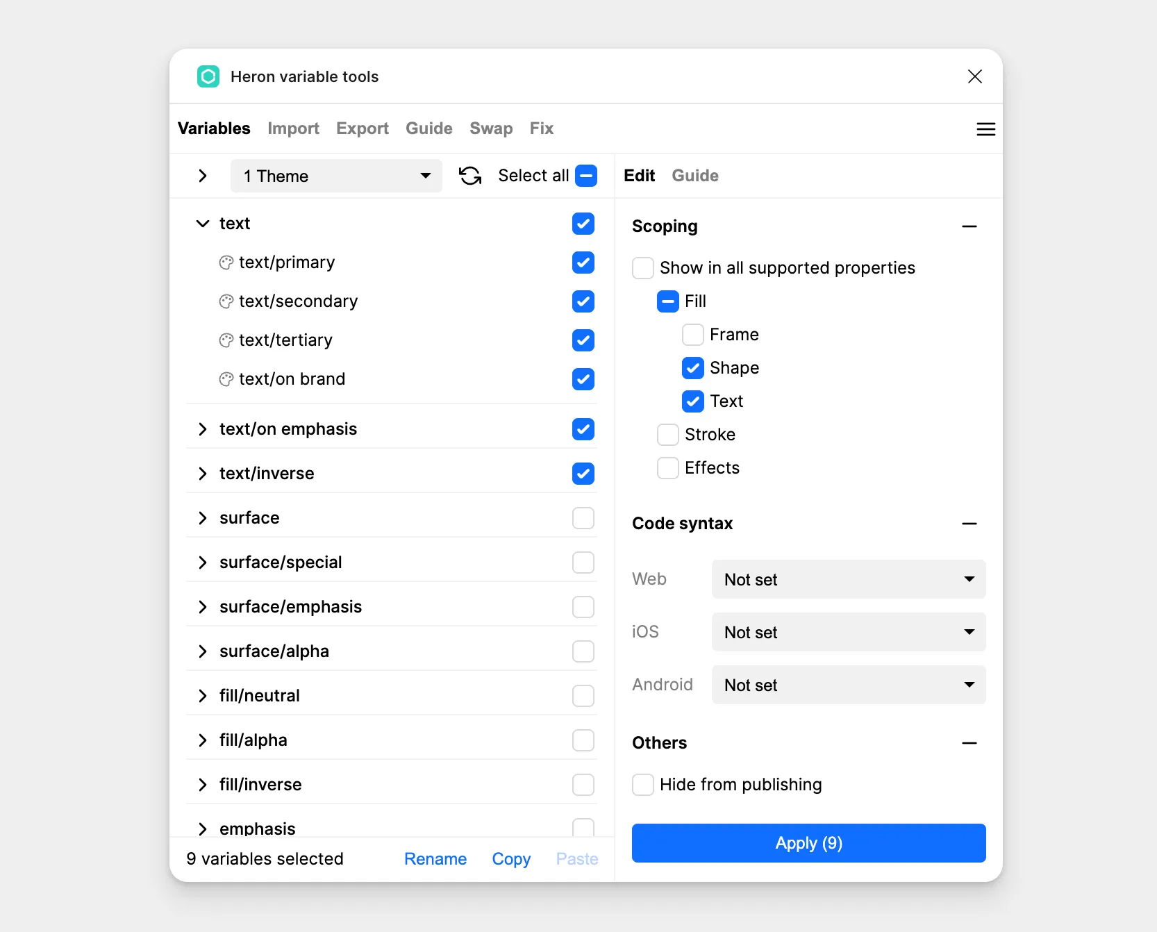
Scope
To make variables easier to use, we can set scopes for variables so unnecessary variables don’t appear during selection. The Heron variable tools plugin allows convenient selection of multiple variables and one-click scope setting.
Variable Code Syntax
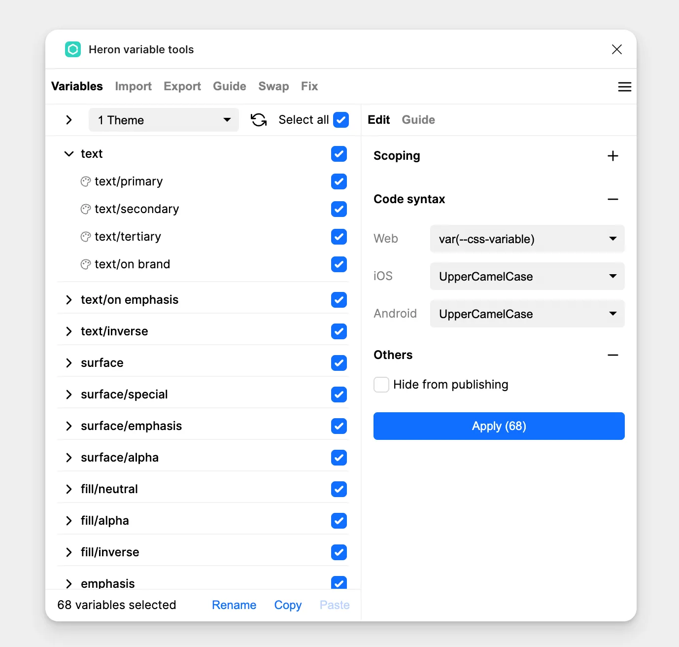
For easier handoff, we can also set code syntax for variables. Using the Heron variable tools plugin to select multiple variables, we can set their code syntax with one click. This way, when developers use dev mode to view designs, they can copy and paste directly into code.
Conclusion
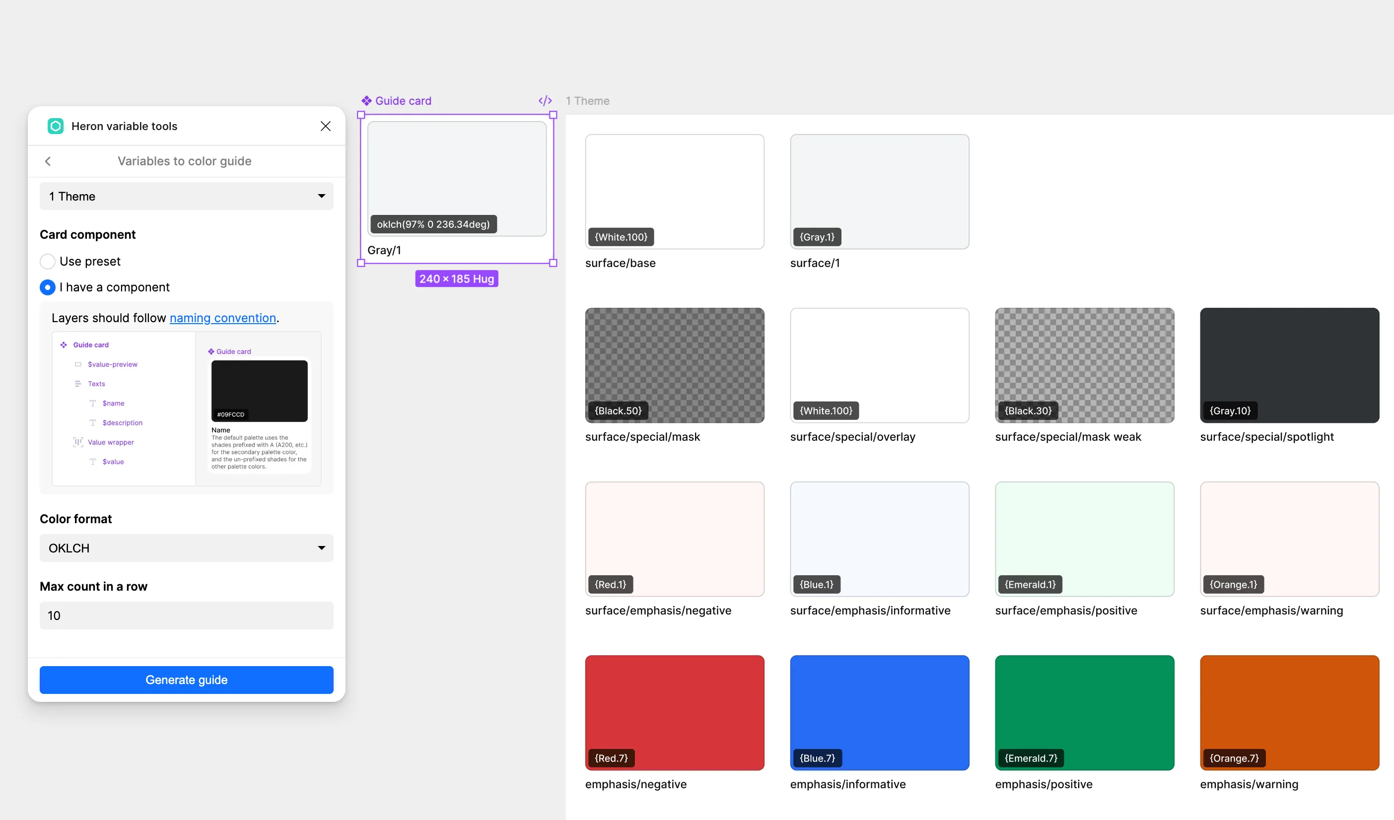
Finally, we can use the Heron variable tools plugin to generate a color guide for easy viewing and showcasing of this color system.
These are the best practices for building a color system in Figma. I hope this provides you with some inspiration.